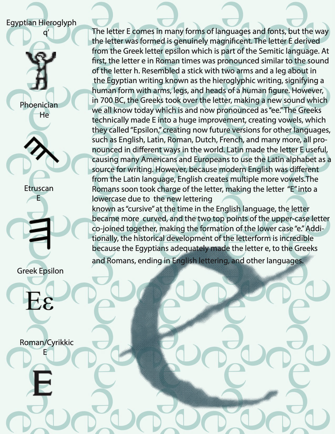
This poster explores the history of the letter "E," tracing its development from ancient hieroglyphs to the modern form we recognize today.
As part of my studies in calligraphy, I chose to focus on the lowercase "e" due to its simple yet elegant design. The letter's form naturally presents a square that can be perceived both inside and outside the pattern
After analyzing various calligraphy fonts, I designed a unique calligraphic "e" to demonstrate my practice with a calligraphy pen. Building on this foundation, I applied color theory to develop a refined pattern and a color scheme dominated by different hues of green, creating a visually cohesive and elegant design.